Post-Impressionists: Georges Seurat

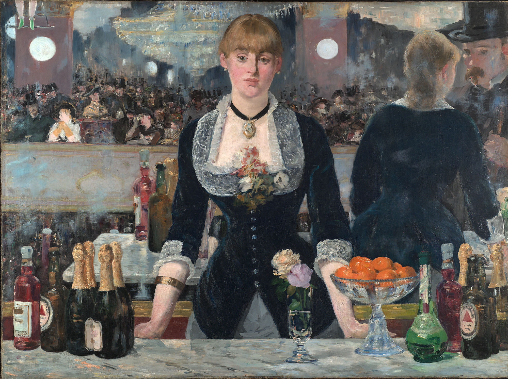
This week Charlotte and I returned to the National Gallery. We have been here a few times with our art class, but each time we return, we explore somewhere new. We went from Impressionism, looking at the Manet and Monet, and on to the Post-Impressionists, Seurat and Van Gogh. The Impressionists were known for experimenting with light and color and capturing the present moment. The Post-Impressionists took off from these ideas, rejecting them in certain aspects in their paintings. They had more form and order in their works, with more of a focus on the meaning of the content.

One painting that immediately struck me was Georges Seurat’s Bathers at Asnieres. This painting is one of the biggest ones in the room so the viewer is drawn to it immediately. I noticed right away the obvious differences between this piece and one of an Impressionist like Monet. This painting is simple yet there is a lot going on. The scene is simply bathers by the water, but business is created with the details in the foreground and background. There is definition to this painting that is unlike Monet, whose obvious brush strokes and usage of color made unclear lines between objects. The color in this painting is also simple, and expected. The sky is blue, the grass is green; there is no experimentation at all. This painting almost seems like a photograph. Until you look at the people that is. The people are almost ghostly looking, with no expression or definition at all. This is one major difference between the Post-Impressionists and the Impressionists, and even the Pre-Raphaelites who had come before. If you look at a person in a painting done by Manet (Impressionist) or Millais (Pre-Raphaelite), there is significantly more detail on their features. In Seurat’s painting, it is clear that the people are not the focus. As a leading Post-Impressionist, Seurat strayed away from the risks and experimentations done by the Impressionists. He aimed to for more traditional and structured paintings, and this piece definitely has both those elements.


-Kasey & Charlotte

Impressionists: Claude Monet

This week Charlotte and I dove into Impressionism with our art class. Impressionism was an art movement in Paris that began with Edouard Manet in the late 19th century. This style was primarily distinguished by new usage of bright colors, light and quick brush work. Their aim was to create an impression of a captured moment in contemporary life.

One of the worlds most famous Impressionists whose paintings I saw at the Courtauld Gallery was Claude Monet. I was immediately drawn to his works because they were different than most of the other works I have been seeing in the galleries our class attends. In particular, his painting Vase of Flowers, really intrigued me. From the subject matter, one would think that this painting would simple, but I found myself examining this picture for a while. My interest was sparked by the structure created by his brushwork. The lines of the painting seemed to blend together. Unlike usual paintings which aim to create a sense of reality, like a still photograph, the objects of this painting were blurred and undefined. This picture had a sense of fuzziness that I had never seen before. Another thing that stuck me about this painting was the usage of color. Monet dabbed on bright colors to create the flowers. The reds and pinks he used contrast the cool colors of the rest of the paintings. Multiple colors are used for the table and background, with strokes of yellows, greens and blues. At first, I was so taken back by how different the painting style was that I disliked the painting. But the more I looked at it, the more I appreciated how playful Monet was with his colors and brush strokes. The not so simple Vase of Flowers definitely made an impression on me.


Kasey & Charlotte

The Courtauld Gallery: Manet

A Bar at the Folies-Bergère - Manet

Let’s fast forward a month or so out of Pre Raphaelites and into impressionism for this excerpt. Due to the National Gallery closing this past Monday, our weekly trip to the museum was disturbed. The annoyance of having to take time to walk to another gallery and have less time to look at works wore off when I entered the Courtauld Gallery. Every piece was intriguing and caught my eye right away. I personally am more of an impressionism fan myself so I quite enjoyed the little preview into one of the later sections. Kasey and I observed works by Monet, Manet, Degas and Cézanne.

I had absolutely no difficulty choosing my favourite piece in the gallery; “A Bar at the Folies-Bergère” by Édouard Manet. The piece is colourful but not vivid. The colours are distinct and obvious, however there is a sense of fading within the colours themselves. The oranges are the most vivid part of the painting and the woman’s skin appears to be the lightest. Her pale skin contrasts her dark and mysterious attire. The black stands out against her and perhaps makes her appear even paler than she is. Her appearance seems lifeless and discontent. Her mere position displays boredom and even unhappiness. Behind her is a mirror, displaying the crowd in front of her and presenting it to the viewer. The woman’s central position in the piece allows the viewer to feel as though they are standing at the bar themselves, waiting to be served and join the crowd behind them.

The piece is extremely detailed, starting with each bottle of alcohol, to the glassware and even the reflection of the marble countertop. Even the water in the flower glass is done with care. As your eye moves back however, the details become blurry, especially in the mirror. The crowd lacks detail in comparison to the rest of the piece, however this may act as insight into how crowded the bar was. The people seem to be blending into each other, which emphasizes the closeness between everyone.

In terms of composition, I find the piece quite balanced. The woman in the middle is the focal point of the painting and on her right is the reflection of her customer (questionably) and on her left is the busyness of the bar and the chandelier. Both sides seem to balance each other out. The legs in the top left corner are said to be the legs of an acrobat. Her shoes are fairly vivid in colour; however manage to not instantly stand out.

The piece itself is enthralling. I love the colours, the composition and the notion that the viewer is right there in the painting. It allows me as the viewer to connect more with the woman, who stands in front seeming depressed and unenthusiastic. The mood of the piece connects to me as a viewer because of the woman. Her facial expression and body language is depressing. It gives me an idea of the type of place the woman is working in. I find the piece and the message behind it very captivating. This is probably my favourite piece of the ones we have studied thus far.

-Charlotte & Kasey

Tate Britain: Ophelia

Ophelia - Millais

This week our class visited the Tate Britain. We looked at the founding artists, Millais, Rossetti, and Hunt; observing how their works segregated themselves from the ‘rules’ of composition and tones. The works were set aside from others of the time in terms of the story they told.

The piece that captured my attention was “Ophelia” by John Everett Millais. Having just come out of high school and studied Hamlet by William Shakespeare, the content of the work stood out to me. Unlike other works, this one I was able to understand right away. There was no need to observe it for long in order to understand what is going on in the piece. The woman floating in the water is in fact Ophelia, Hamlet’s distressed lover, who dies drowning herself.

Like other Pre Raphaelite artworks, this piece encompasses a strong sense of nature, probably more than most other works. The colours are vivid, creating a sense of tranquility in the work, despite the somewhat demoralizing subject. The flowers also touch on the peaceful tone, however they are also seem relevant to the play, Hamlet, in which Ophelia’s madness leads to her ill-sounding speeches about flowers. Ophelia lies peacefully in the water; her hands are delicately raised above the water and her eyes half open. It is the scenery around Ophelia that allows the sense of peace to be maintained as if the focus was on her face the piece would be composed of a different tone.

The detail in the nature around Ophelia is extremely visible, which is also a notable characteristic in the Pre Raphaelite’s doctrines. Her clothing is the dullest colour in the whole piece, which may also symbolize the lack of life in her body. The expression of lines within the piece is evident. Ophelia lies horizontally in relation to the piece, as does the tree behind her. The bottom left side however, encompasses vertical lines as the plant shoots up from the ground. The vertical lines of the plant lead the viewer’s eyes to Ophelia’s face and gives the sense that she is being ‘boxed in.’

Unlike most other Pre Raphaelite works, the detail of this piece is mostly in the background, and the lack thereof lies in the foreground. Most of the other works I have observed give focus to the foreground in terms of detail and make the backgrounds less dimensional. This separates this piece from other of the Pre Raphaelites. Likewise, this piece does not contain religious statement, as is commonly seen in Pre Raphaelite work.

The focal point is not directly obvious, as all the aspects of this piece seem to stand out in different ways; the lack of dimension also contributes to this. This piece is unique both in its story as well as its composition and allows viewers to consistently question the Pre Raphaelite’s doctrines.

-Charlotte & Kasey

Tate Britain: Pre-Raphaelites and Christ in the House of his Parents

Our weekly gallery visits with our art history class recently took us to Tate Britain. Here Charlotte and I looked at paintings done by the Pre-Raphaelites, a rebellious group of artists going against the principles they were taught at the Royal Academy School in the 1840’s. Their works abandoned previous ideas of composition, tone and color. We saw paintings in Tate Britain by the three founders, John Everett Millais, William Holman Hunt, and Dante Gabriel Rossetti. Their pieces focused on new subject matters, women in particular, with a more intense sense of realism and detail than previously seen before.

One piece that struck me was Millais’ “Christ in the House of His Parents”. I stared at this painting for a while trying to understand it. It was unlike any other religious piece I had seen so far in my study of art history. Usually works pertaining to religion are heavily focused on making the figures look godly and holy, but in this one, it took me a few minutes to figure out which figure was Christ. He was in the center, with the focus around him as his family members tended to the bleeding coming from his hand. But he looked sad, and sort of ugly, a depiction of him which I was not used to. Mary leaning next to him, and Joseph grabbing his hand, also looked washed out and unpleasant. When this painting was released in 1849, a year after the Pre-Raphaelites founding, I can see why people were insulted by it. Millais showed the true side of Christ, rather than the idealized image of Christ glowing with a ring of light around him. This painting, in addition to being realistic, is also quite suggestive of the crucifixion of Christ. Christ, though only a child in the painting, has cut his hand on a nail, and his blood has dripped down to his foot. Behind him there are tools foreshadowing his gruesome death. His family is tending to him, as sheep, almost symbolizing his followers, watch him in his pain.

Besides the religious statement given by this piece, I could also tell it was a Pre-Raphaelite work by the usage of detail, space and composition. This is one of the most detailed paintings I have seen. You can clearly see the eyelashes on Christ, the veins in the arms of Joseph, and the wrinkles on Mary’s forehead. The usage of space makes you feel like you are in the room with the figures. This perspective is created because you can see right into the back of the room around the corners, but also out the windows to the outside scene. For composition, there is no Golden Section which I found in each of the paintings I had seen before. There are dominant lines though, horizontals of the center table and windows, and the verticals of the walls. Most interestingly, there are diagonals created by the peoples’ position, all seeming to point towards Christ.

The Pre-Raphaelites successfully abandoned the traditional ways of painting in pieces like “Christ in the House of His Parents”. They made a bold statement, and created a new way of art.


– Kasey & Charlotte 

The Watering Place: Gainsborough v.s Ruben

The National Gallery in London holds both Peter Paul Ruben’s and Thomas Gainsborough’s versions of the Watering Place. These two paintings have the same name though they were painted over a decade apart. Ruben painted his version of the Watering Place between 1615 and 1622, greatly influencing Gainsborough to paint his Watering Place around the year of 1777.  Despite having the same name, these paintings convey completely different messages.  Ruben’s version focuses more on the human contact with the animals, showing the interactions between them. The humans are controlling the animals, sitting on them and guiding them in certain directions. In Gainsborough’s version, the animals are the main focus. They gather around the watering place, as the light shines on them and they peacefully drink their water. One has to look for the humans in Gainsborough’s painting, because they are almost blending into the background, painted in the same colors and positions as the dark trees behind them. They are relaxing on the grass, barely paying attention to the animals in front of them. The humans in Ruben’s version are hard working, very unlike the humans in Gainsboroughs. Through the color choices and usage of sunlight, Ruben’s painting is portrayed bright and lively, while Gainsborough’s is soft and serene. It is interesting how the same idea of a watering place is interpreted so differently between two artists.

-Kasey & Charlotte 

The Watering Place The Watering Place

The National Gallery: Family Portraits

 Weekly visits to museums lead to weekly blog updates, shocking I know. This week: The National Gallery of London.

The focus of the week is British Art 1750-1850. As Kasey and I toured the countless rooms of the museum, we were challenged with works that, as teenagers, we are less likely to be drawn to; and we loved it. We saw works created by Joshua Reynolds, Thomas Gainsborough, J.M.W. Turner, Claude and John Constable. The focus varied from portraits to landscapes and encompassed a wide range of colours, tones and moods.

Two of the works we observed were Joshua Reynold’s “Lady Cockburn and her Three Eldest Sons” and Anthony Van Dyck’s “Charity.” The two works are portraits of a woman and her three sons. Reynold’s piece, which was inspired by “Charity,” is fairly similar, however not identical. This can be seen through the colours, the mood and the tone. Reynold’s piece demonstrates wealth in the family through the use of red colours (mainly the sheet enveloping the pillar in the background) and the extravagant clothing Lady Cockburn wears. The colours, mainly primary are warm and rich, thus accenting the light background and dark foreground of the artwork. The sky in the background seems light and peaceful despite the few clouds. Lady Cockburn’s gaze appears dismissive, however at the same time, motherly. She appears to be physically occupied with her three sons, but mentally occupied in her thoughts. This leaves the tone of the artwork to be rather cold and unemotional.

In contrast, Van Dyck’s “Charity” depicts less wealth than Reynold’s piece. The woman is dressed in cloth rather than in a wealthy robe and the sons are not wrapped in fabric, unlike those of Lady Cockburn. The colours, also primary, seem darker in this piece. The sky in the background is not as bright. The woman, in contrast to Lady Cockburn appears to be staring above, almost as if she is looking into the heavens for guidance whereas her three sons look to her. She seems less occupied by personal matters compared to Lady Cockburn, and rather seems to have “her hands full” with motherhood.

“Charity” seems rather more religious than “Lady Cockburn and her Three Eldest Sons.” The two works resemble each other but seem to have different meanings, which can be seen through the tone and the mood of the works.

-Charlotte & Kasey

Lady Cockburn and her Three Eldest Sons Charity